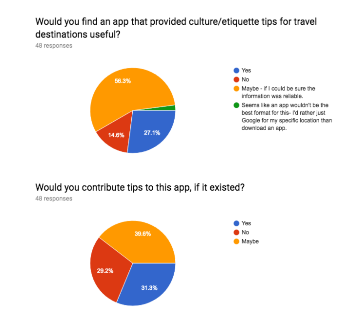
For my prototype on Movies@Dundrum booking process I decided not to devote too much time into things like colour scheme and layout changes unless these things had a direct impact on user usability.
The most work on the prototype went into the homepage / movie selection process. The overwhelming opinion among our survey takers when they were shown the Movies@Dundrum homepage was the sheer clutter making finding anything automatically a much harder process than is necessary.
Prototype Screen 1 – Homepage
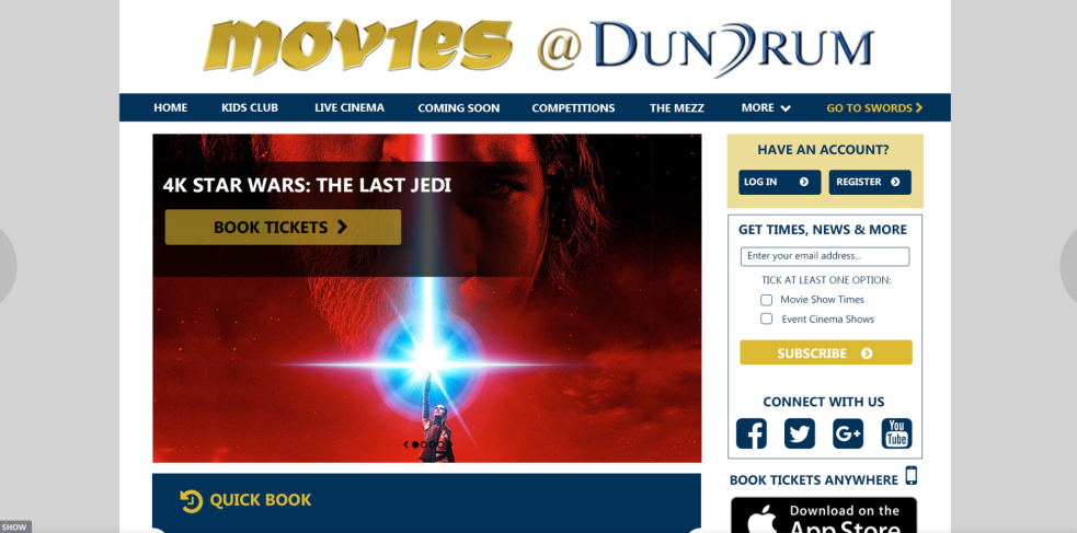
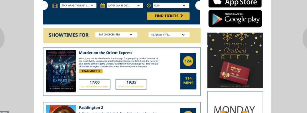
To combat these issues the biggest changes I made was to de-clutter the screen from distracting background images, and to provide users with a Quick Book option. I think this Quick Book will have the biggest affect to usability for potential users as we saw from our survey most users are not here to browse, they are here to book so it makes sense to provide them with as little work to do as possible in this scenario. I also neatened up the film card sections as well trying to make the information our users would find helpful such as ticket availability and running time clear and obvious.
Prototype Screen 2 – Ticket Type
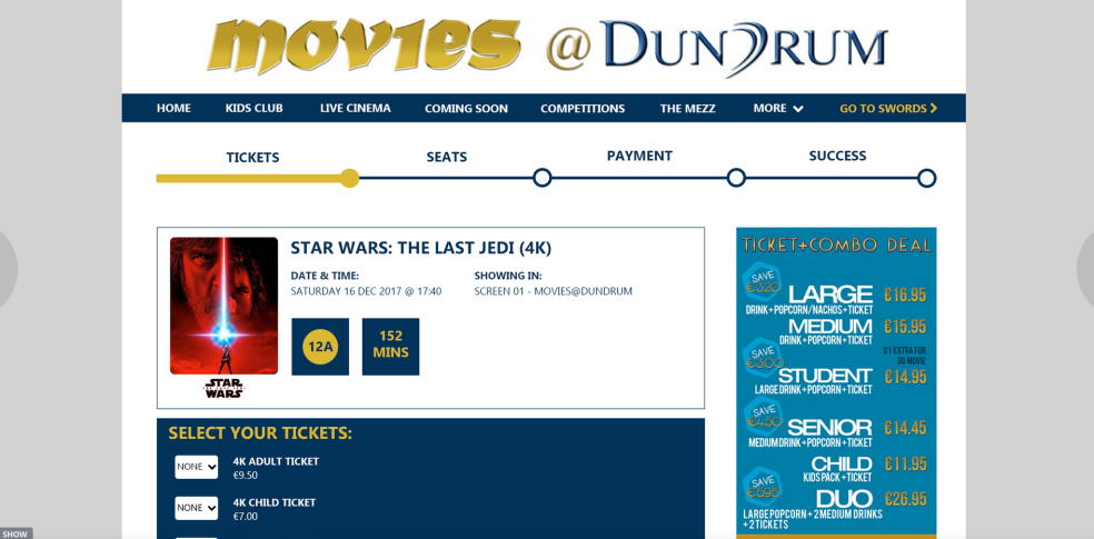
The main issue with the ticket type selection part of the process was the massive combo advertisement image which completely hid what the user actually needed to be focusing on in this section. Without sacrificing this image and by simply condensing and re-positioning the user can now easily see what deals are available without losing sight of the real purpose of this page. I left the right side of the ticket type section blank as some screenings display the combo ticket types as well as the standard ticket types so this free space will be needed. The other addition to this part of the process is the progress bar along the top, designed to keep our user well informed along their journey without being obtrusive.
Prototype Screen 3 – Seat Selection
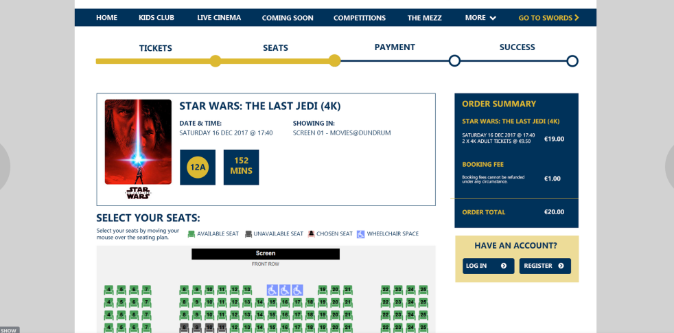

An addition of an order summary section I felt was missing from the original process, which I have done so here on the right hand side. The other major change was to the navigation buttons along the bottom, which not only were missing from some sections of the original booking process but even when visible were not exactly clear as to what their action outcome would be. I tried to make these navigation links as obvious and understandable as possible.
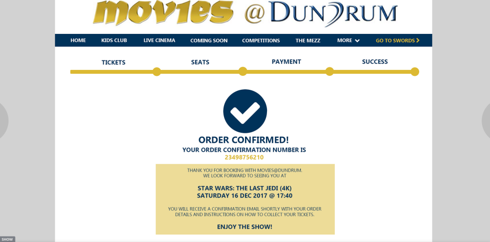
Prototype Screen 4/5 – Payment & Confirmation
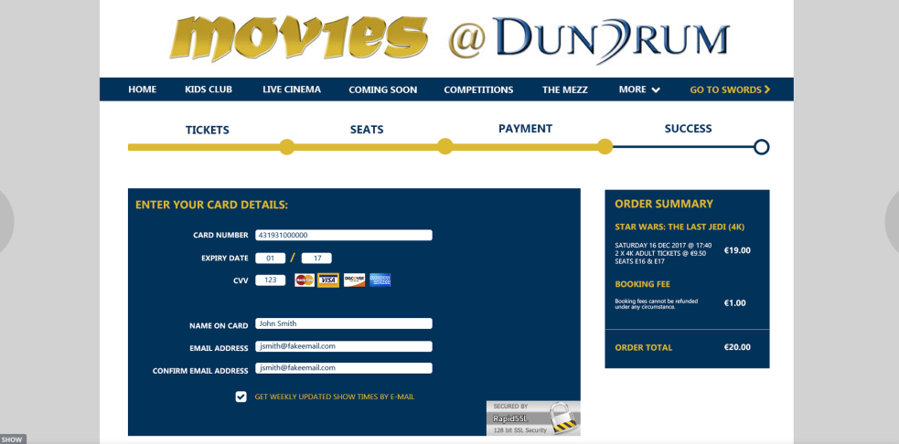
Again an order summary was missing from the original process from I think the most important step that it is needed. Users need to be presented clearly with what their order contains before they commit by making a payment in order to prevent as much chance for error as possible.
User Tests
I completed two user tests once the prototype was complete; one with the original booking process that currently exists on Movies@Dundrum’s site, and the second with the new prototype in order to compare and contrast the differences between the two user experiences. The user was not local to the Dublin area so had actually never purchased tickets or even visited the Movies@Dundrum site before the test which was beneficial as no expectations or opinions would have been set with the user.
User Test 1 – Movies@Dundrum Existing Process
User Test 2 – Movies@Dundrum Prototype Process
As suspected the user struggled the most with the initial discovery of the movie times with the existing process, making the comment that there was a lot going on in the screen so that even if there was a quicker search option they would have struggled to see it. The prototype performed much better in this regard, the quick book option performing well in guiding the user seamlessly into their order. There was a slight stumble by the user when trying to select the times within the quick book option, I think this can be easily solved by making the MEZZ times more distinguishable from the standard screening times.
I also think the payment page needs a little more work in terms of layout, there was a little bit of hesitation from the user on the confirmation checkboxes of this section. These would benefit from more prominence on the screen and perhaps reducing the prominence of other sections such as the voucher/loyalty card sections, perhaps these can be collapsed within their own sections and only expanded if the user chooses to do so.
Overall, going by just the actual length of time it took our user to complete both processes the prototype is already performing much better in this regard, without sacrificing any of the necessary information from the original process.