
-
CultureMee
 |
 |
 |
 |
 |
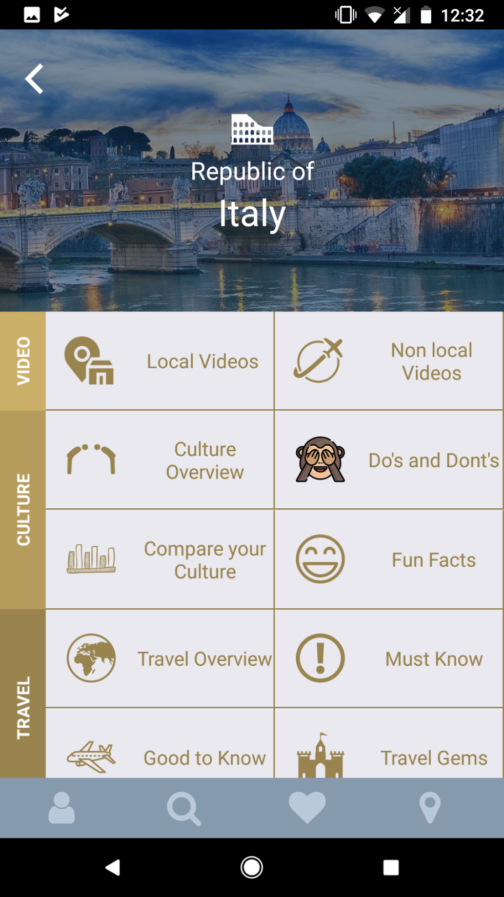 |
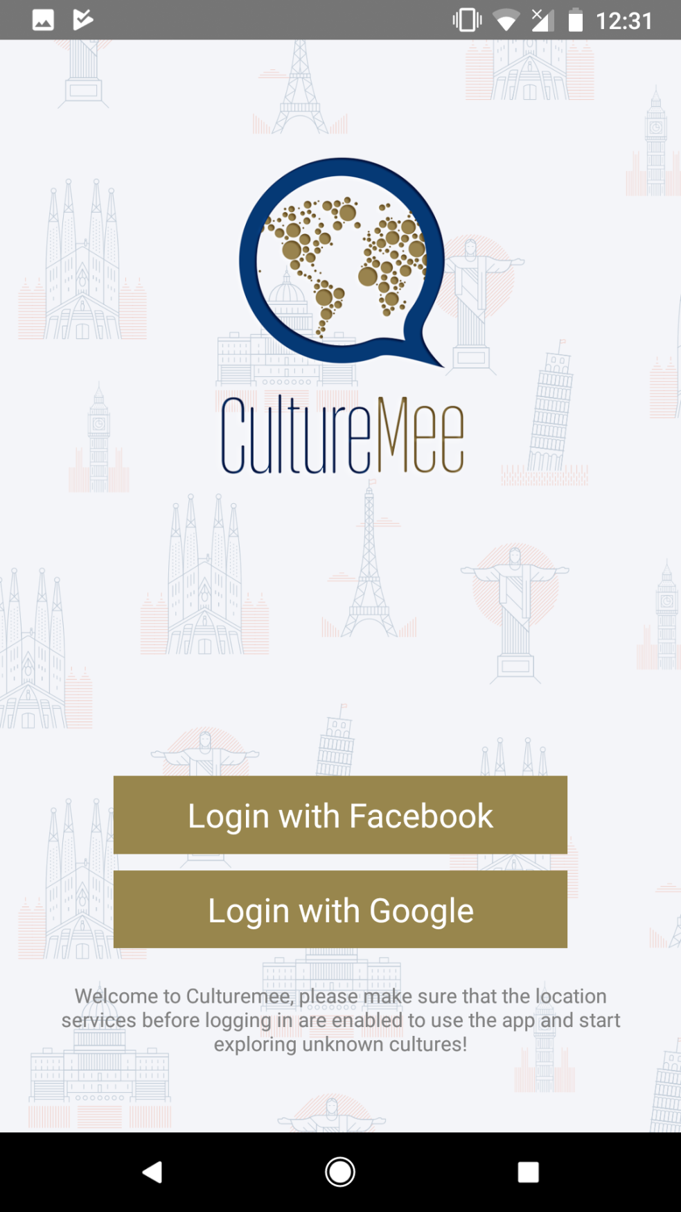
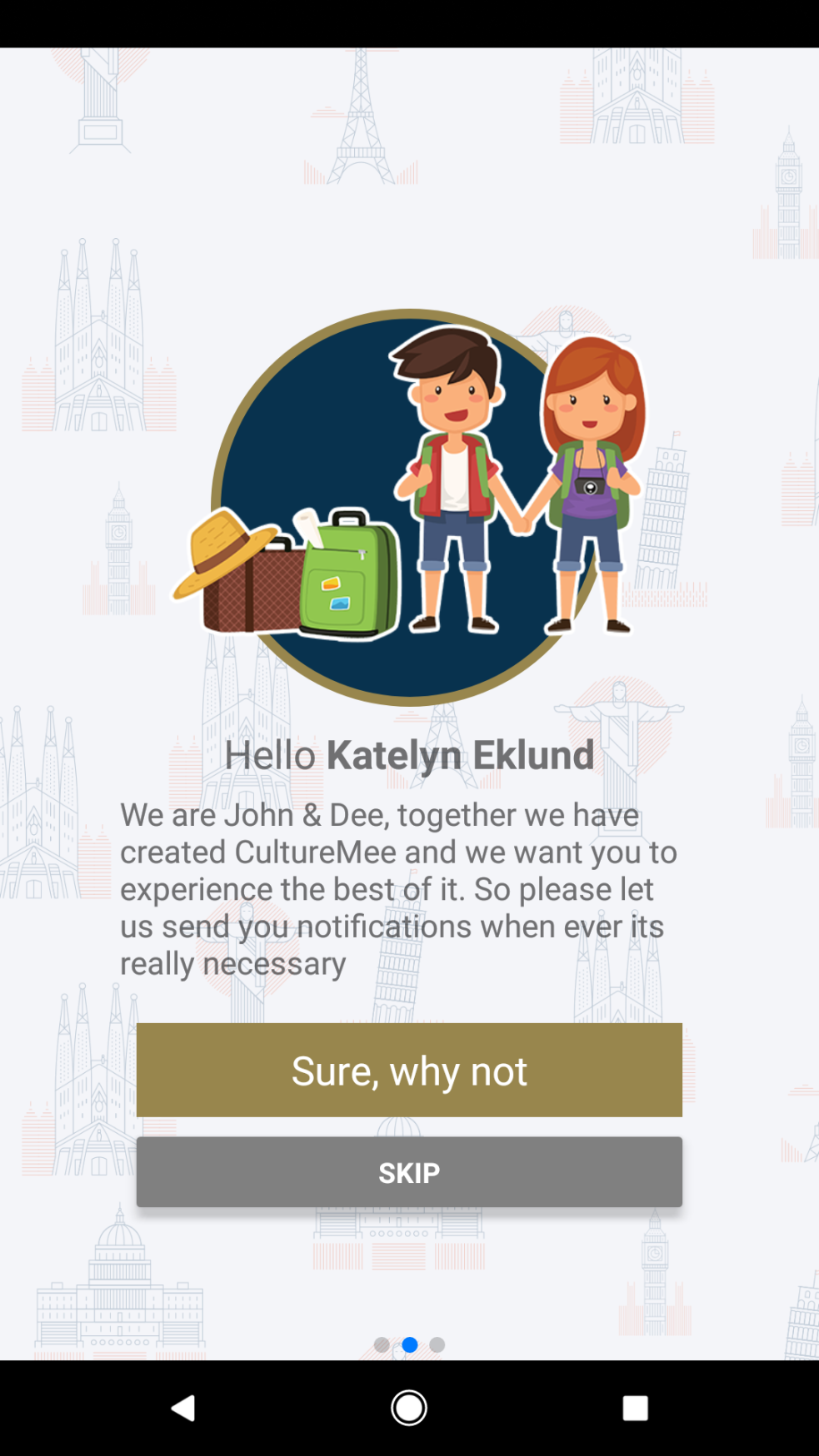
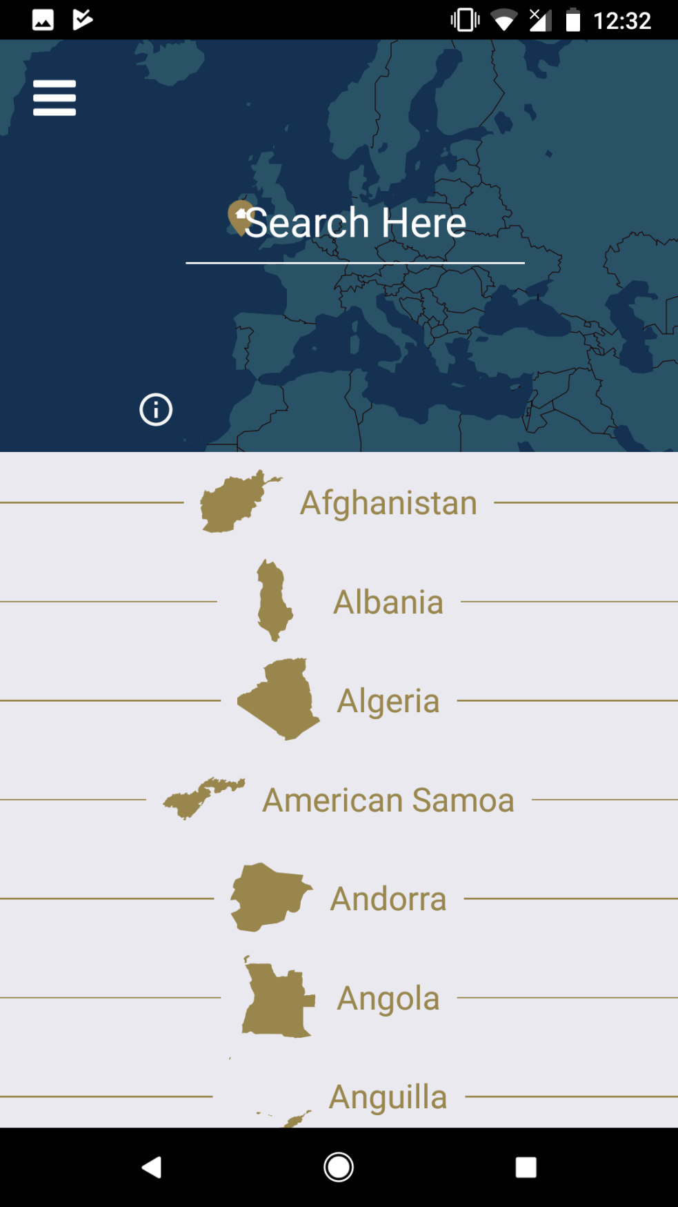
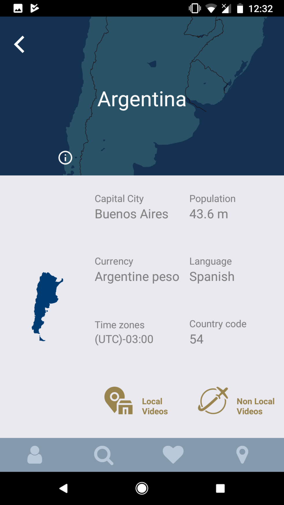
The CultureMee app was probably most similar in structure to what we are trying to acheive with the client’s app. However, the biggest thing I felt was lacking from the CultureMee app was the intuitive ability to give users an option to explore nearby. The layout of the destination overview as well was slightly muddled, it is not immediately apparent what the difference between some of the sections are e.g. Must Know, Good to Know, and Dos and Don’ts all sound like very similar categories. There was also no option for users to contribute tips, this meant that a lot of countries and destinations were in fact missing information, making the app effectively incomplete.
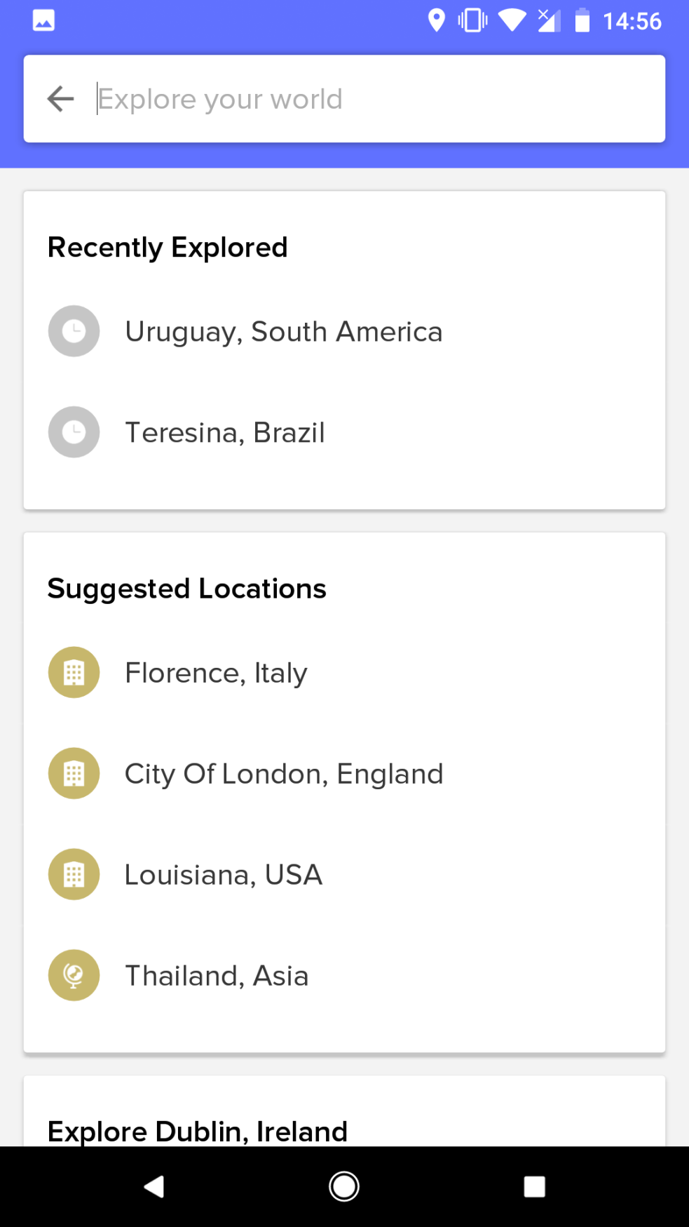
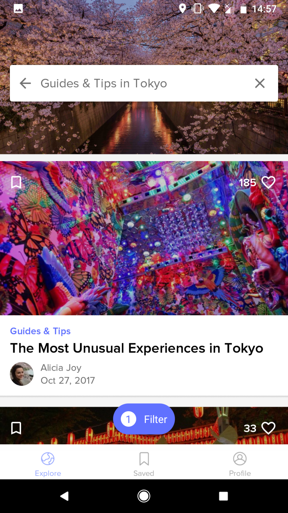
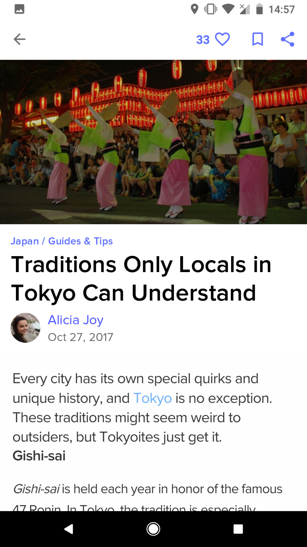
2. CultureTrip
 |
 |
 |
 |
 |
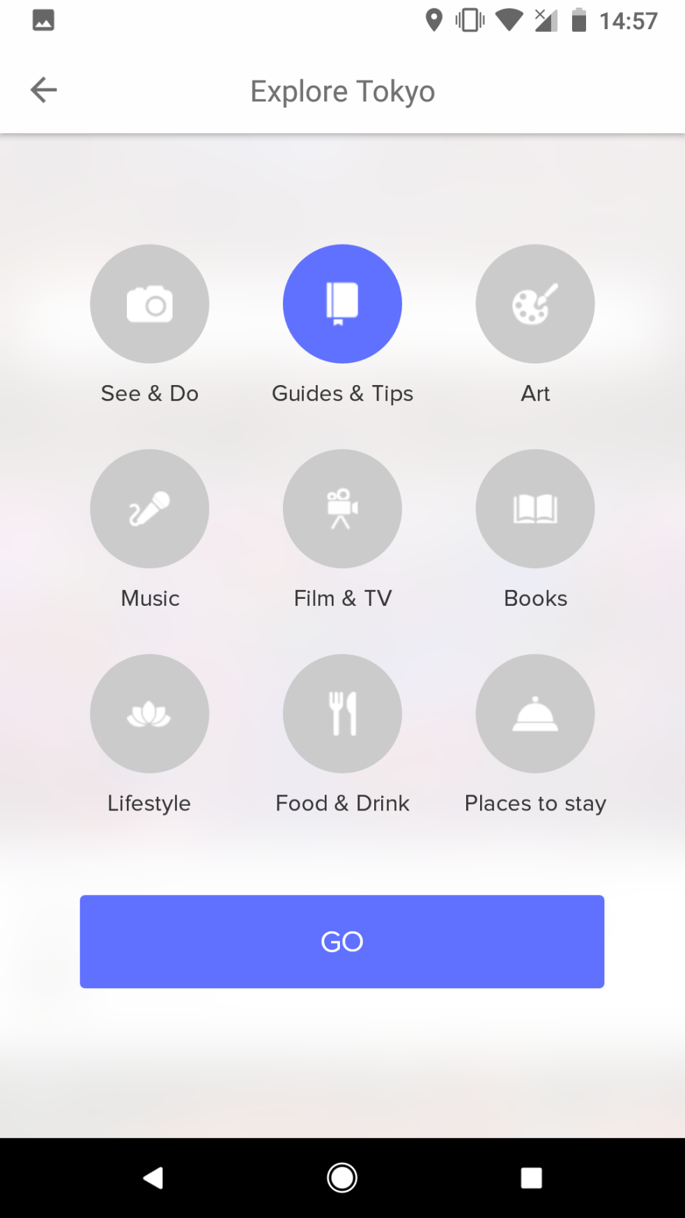 |
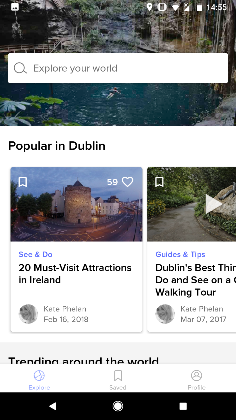
The CultureTrip app I thought was very well laid out and designed. However, in terms of it being a competitor their ‘Guides and Tips’ section is a comparatively small part of the app as a whole, and once discovered it is not really a concise list of tips as the client’s app is hoping to provide but more long winded articles going into a lot of detail on the history of the chosen destination. This is more suited for people who might simply want to learn more about a country’s culture but not so helpful for someone trying to plan a trip to said country, making it difficult to pick out the bits of information that might be useful.
